Does anyone else recall being taught the colors of the rainbow in Kindergarten? Despite CMYK printing existing since 1906, most kids are taught there are only three-primary colors: red, yellow, and blue. With these we were told we could make any color we wanted.
In practice, however, we later find this not to be true. Certain color combinations only produce interesting shades of brown and making green requires more blue than yellow. But Newton’s Color Circle is what we are taught because the red, yellow, blue color wheel is just easier for kids to understand. Much less, those colors positively affect a child’s learning.
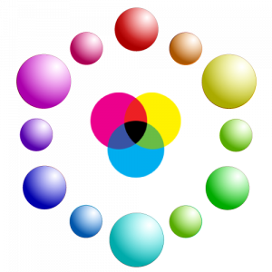
The CMYK color spectrum requires a bit more work. There are 12-colors instead of seven, with cyan, magenta, and yellow being primary. Cyan, of course, is a shade of blue, magenta a shade of red, and yellow is yellow. Certainly someone, somewhere along the way decided red, yellow, and blue was easier on young minds, and on parents of 5-year olds whose most frequent response if to ask, “Why?”
Regardless, it is true all hues can in fact be obtained by mixing primary colors of CMYK. Depending on the application, such as kindergarten students, it’s red, yellow, and blue. But, if it’s television, stage or even ambient lighting, it’s red, green, and blue. When those three colors of light are focused on the same place, they form white light. However, print and paint do not work the same as light. For that, the primary colors are cyan, yellow, and magenta. When combined, the form black, even though most CMYK printers had a black ink reservoir.

Primary Colors
The CMYK color wheel is based on the three primary colors of cyan, magenta, and yellow; three secondary colors red, green and blue that can be made by mixing primary colors; and six tertiary colors from mixing primary and secondary colors to get orange, chartreuse, spring green, azure, violet, and rose.

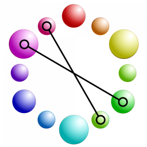
Complementary Colors
Colors at opposite sides of the color wheel have the highest contrast. That is because their values are inverse and will turn gray when mixed. Changes from the red, yellow, blue color wheel show us that green and red are not really complementary while blue and yellow stay the same. In life, evidence of contrast efficacy can be seen in most police cars that use red and cyan emergency lights to make them more visible in traffic.

Monochromatic Colors
Using the values of a single color—or hue—for contrast is how we create monochrome palettes. On a scale of lightest to darkest and express as shade, tone, and tint. Appropriately named, shade is the amount of black used to darken a color. However, tint is the level of white used to lighten a hue and Tone is the amount of gray included. Using a single hue contrasted by these values is monochrome.

Analogous Colors
Not to be confused with monochromatic, an analogous color scheme groups any three neighboring colors to form a color scheme.

Split Complementary Colors
Split complementary is one where the two analogous colors complementary to a selected color are used to form a color scheme. In this case, red has been [aired with azure and spring green.

Triadic Colors
A triadic color palette consists of any three equidistant colors on a color wheel. While this is not exclusive to CMYK, it is recommended all colors come from the same wheel.

Tetradic Colors
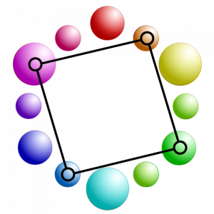
Pairing two sets of complimentary colors is tetradic. This more frequently appears as part of a decorated theme that includes analogous objects against an analogous background. An example of this would be a magenta armchair that doesn’t quite match the rose color of a couch in a room painted Spring Green with green trim.

Square Colors
A square color palette consists of any four equidistant colors on a color wheel. While this is similar to Tetradic, it removes the option of using analogous colors. It is a bold palette that if done well, can be amazing. It would work similar to the tetradic example, but instead, the paint colors would appear better in the darkest hues and the furniture in the lighter colors.

