Early Greek scholars mirrored the relationships of colors with their understanding of the four elements. From light to dark, this held the black Earth at the lowest and yellow air at the highest. On a scale of warmth was red fire opposite white for water. While it does sound very impractical, theorist and abstract art pioneer, Wassily Kandinsky incorporated this understanding of color theory into his own work. Viewing each of the elements as an appeal to the viewers' senses of scent, sound, taste, and touch. In a sense, viewing art was a spiritual experience and his work is very much reflects confessional moment, laying bare the life of an artist and his relationship with the world around him.

Kandinsky wrote about the meanings of color in his book, “Concerning the Spiritual in Art.” On its Greek roots, he wrote shades of red can both be like a flame, warm and exciting or painful. He describes keen yellow as sour, like a lemon. He took great care with white, suggesting it spoke of birth and possibilities. Then, he described black as "an eternal silence, without future and hope.”
Kandinsky used other colors. He had this curious sense of how on a “sensitive people,” the experience of one sense can leave an impression on the soul and influence the perceptions of their other senses. He anecdotally mentions a doctor he knew whose patient could not eat a particular sauce without tasting the color blue.
Color also made music, which was not an uncommon observation. In his earliest work on the subject, Sir Isaac Newton attempted to classify colors by music notation. Kandinsky made his reference when theorizing on texture, “Shades of colour [sic], like those of sound, are of a much finer texture and awake in the soul emotions too fine to be expressed in words.”
Much later in his career, Kandinsky experimented with adding materials to his paints to create visible textures. He mixed these understandings with his appreciation for jazz and commitment to faith to create an array of elements in his art that make his work a true snapshot of the artist’s mind.

My preferred example for Kandinsky is in his painting, Composition VIII. Kandinsky’s use of color is elegant in its simplicity. Over a muted canvas, colors and contrast drive the viewer from one event to the next. Each pop is its own story. Some colors are complimentary and others analogous. But perhaps most interesting is his matching tint when he pairs analogous colors and contrasts shade and tone when he pairs complimentary colors.

Kandinsky’s use of palette somewhat fools the observer that might be attentive to the yellow and red when really the gray and brown are the base colors. The yellow has been shaded with the brown and the red has been similarly tinted by the gray.
Similar colors can be found in Behr’s Yellow Gold, Sherwin-Williams’ Pennywise, and Benjamin-Moore’s Metropolis and Roseate.

Kandinsky’s use of paint almost guarantees colors that have never been seen in art before or since. The eclipsing sun in the upper right of his painting is not a true red, but it’s not orange. With just a slight tinge of yellow, the shape glows by itself. It’s likely a mix of the yellow used in its corona and the red from the eclipsing corona.
Similar colors can be found in Behr’s red shade, Grenadine, Pecos Spice, and yellow toned, Solar Energy.

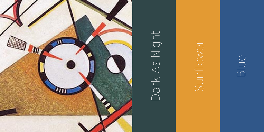
Yellow and blue circles appear lower in the painting. Kandinsky wrote of these as eccentric and concentric movements saying where the yellow spreads out from the center, blue moves in on itself. Regardless, yellow and blue are complimentary colors on the CMYK color wheel. However, he proportionately shaded the circles and tinted the halos, which makes their relationships tetradic.
Similar colors can be found in Sherwin-Williams’ Yellow Bird, Majestic , Benjamin-Moore's Paddington, and Behr’s Bluebird.
Most colors work well with brown because any two complimentary colors will make it. For instance, red and green will make brown. Orange and blue will too. In simplified terms, brown has an element of each color. For that reason, brown is a neutral color, which is also why brown is a common color in carpets and furniture.
Similar colors can be found in Behr’s Dark As Night, Sherwin-Williams’ Sunflower, and Benjamin-Moore’s Blue.
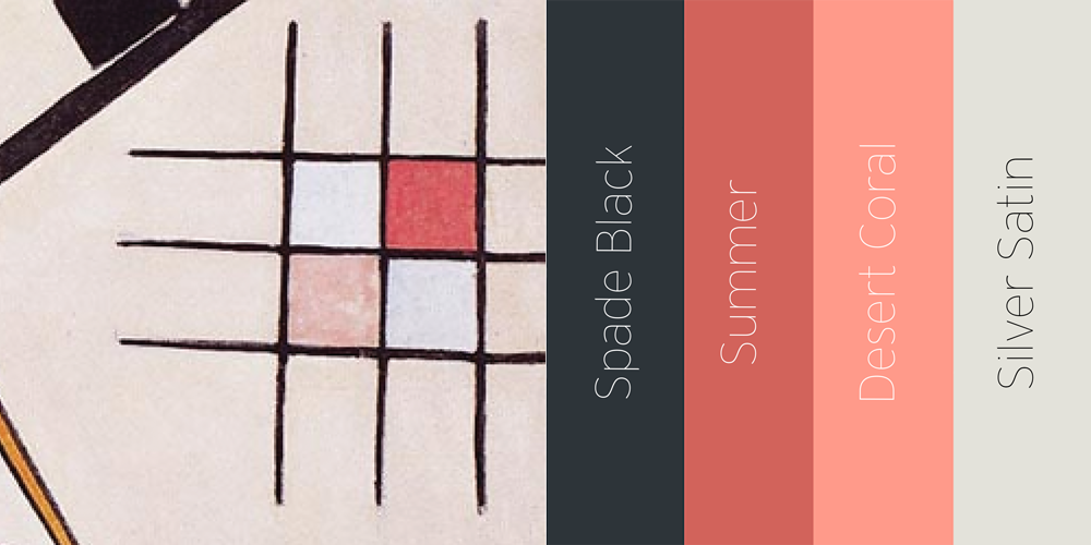
Tones and tints of red are another example of monochromatic contrasted with tinted black and an iridescent toned gray.
Similar colors can be found in Behr’s Spade Black and Desert Coral. Benjamin Moore’s Silver Satin. On analysis, Spade Black is a deep shade of blue and Desert Coral is a tinted yellow, making them complimentary colors.